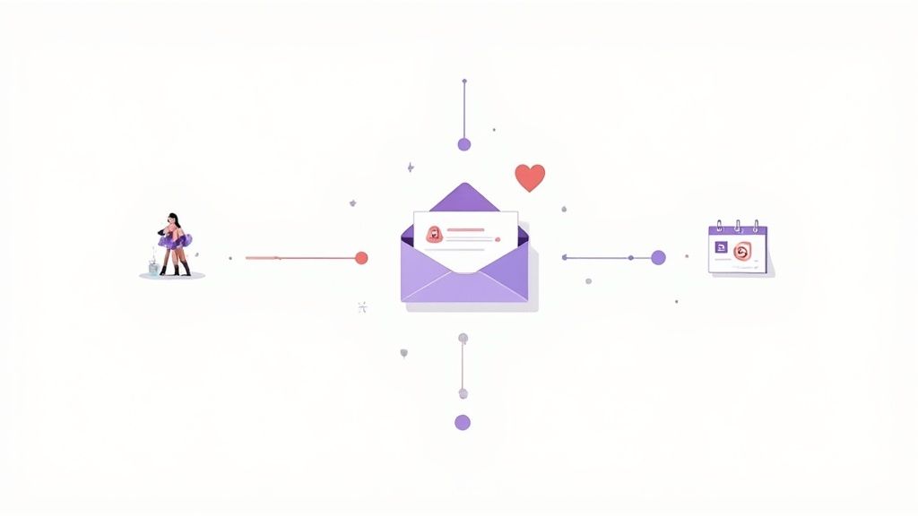
Your Guide to a High-Converting Mail List Sign Up Form
December 10, 2025

A high-converting mail list sign up form is the engine of your email marketing. It’s the single best way to turn casual website visitors into a community of loyal customers, giving you a direct line of communication that you completely own—no social media algorithms involved.
Why Your Email List Is Your Best Marketing Asset
In a world where social media trends and search engine updates can change overnight, your email list is the one marketing channel that’s truly yours. Think of it as a direct, personal line to people who have actively asked to hear from you. For any UK small business, that’s an incredibly powerful tool for building genuine relationships and driving reliable income.
Unlike a paid ad or a social post fighting for attention in a noisy feed, an email arrives in someone’s personal inbox. This unique position gives you the space to build trust over time, nurture potential customers, and guide them from casual interest to making a purchase, all without having to constantly pay for visibility.
The Tangible Power of a Direct Connection
Let’s trace a typical customer journey. Someone finds your business through Google, has a look around, and then clicks away. Without a mail list sign up prompt, that potential customer is probably gone for good. But if you capture their email, you’ve just opened the door to continue the conversation.
An email list isn't just a collection of contacts; it's a community of potential and existing customers who are actively interested in your brand. This makes it the perfect audience for new product launches, exclusive offers, and valuable content that reinforces your expertise.
For UK businesses, the return on investment is undeniable. Email lists show incredible effectiveness, with average open rates often hitting between 40-55% and conversion rates hovering around 3.5–4%. When you compare that to the sub-1% engagement you typically see on organic social media, it’s clear where your marketing efforts can make the biggest impact. You can read the full research on UK email list performance from House of Admin.
Turning Sign-Ups into Sustainable Growth
Every single new subscriber is an opportunity. Let’s imagine a real-world scenario: a local bakery in Manchester uses its email list to announce a limited-edition bake each week.
- Building Anticipation: They don’t just sell; they tell a story. An email on Tuesday might drop a few hints about the new creation.
- Driving Action: On Friday, an exclusive email goes out to subscribers with a special pre-order link.
- Fostering Loyalty: This simple workflow generates a real buzz, pretty much guarantees a sell-out, and makes subscribers feel like valued insiders.
This simple strategy transforms a mailing list from a simple contact database into a predictable sales channel. It’s proof that consistent, value-driven communication is the secret to turning a casual browser into a loyal advocate for your brand. It’s all about building relationships, not just chasing clicks.
Designing a Sign-Up Form That People Actually Use
Your website’s design and the words you use can make or break your efforts to grow a mailing list. Let's be honest, a poorly designed form is just annoying—it feels intrusive and confusing. But a well-crafted one? It feels like a natural, valuable next step for someone browsing your site. The goal is to make signing up an easy, almost instinctive decision.
The first thing to sort out is the type of form you'll use. Each one has its own strengths, and the best choice really depends on your website's layout and how visitors move through it. Don't just pick one at random; think about the user's experience first.
- Pop-up Forms: These are the ones that appear over the page content. They can be incredibly effective, but you need to use them thoughtfully. Triggering a pop-up on 'exit-intent'—when someone moves their mouse to leave the page—is often a winner. It grabs their attention without interrupting their reading.
- Slide-in Forms: A less disruptive option, these forms slide in from a corner as someone scrolls down the page. They work beautifully on blog posts or longer pages where you know the reader is already engaged with what you have to say.
- Embedded Forms: These are static forms built right into your page. You’ll often find them in the website footer or at the very end of an article. They're the least intrusive of the lot and are brilliant for capturing your most dedicated readers.
Crafting Copy That Overcomes Hesitation
Once you've picked your form type, the words you choose are your most powerful tool. Your headline has to grab attention and spell out the value immediately. Vague phrases like "Join Our Newsletter" are just background noise people have learned to ignore. You need to be specific and focus on the benefits.
Think about a UK-based online craft shop. Their first attempt might be:
Before: "Sign Up for Updates"
But a simple tweak makes all the difference:
After: "Get 15% Off Your First Knitting Kit"
See? The second version is instantly more compelling because it answers that unspoken question everyone has: "What's in it for me?" The body text should then briefly back this up and set expectations. Something simple like, "Join our creative community for weekly project ideas and exclusive member discounts," does the job perfectly. It builds trust and eases any worries about getting spammed.
The most effective sign-up forms make a clear promise. Whether it's a discount, a free guide, or exclusive access, your copy must immediately convey why it's worth handing over an email address.
The Small Details That Drive Big Results
It's often the final little touches that have the biggest impact on your conversion rates, but they're so easily overlooked.
Button Text Psychology
The call-to-action (CTA) button is the final hurdle. Generic words like "Submit" or "Subscribe" are dull and uninspiring. Instead, use action-oriented language that reflects the value they're about to receive.
- Instead of "Join," try "Get My Free Guide."
- Instead of "Sign Up," use "Unlock 15% Off."
Balancing Form Fields
Every extra field you add is another reason for someone to give up. For most initial sign-ups, an email address is all you really need. Seriously. You can always gather more information down the line. A simple, one-field form will almost always get you more subscribers than one asking for a name, phone number, and email.
To see how you can create custom fields and manage subscriber data without the fuss, you can explore the various features of Astonish Email. Keeping the initial mail list sign up process this smooth is key to encouraging more people to complete it.
Choosing an Incentive That Attracts Quality Subscribers
A great incentive is the secret sauce for a successful mail list sign up strategy, but it’s not about giving away the farm. The real aim is to offer something that attracts people who are genuinely interested in what you do, not just hunting for a freebie. Your offer should be a taste of the value your brand consistently provides, making it a natural first step in what you hope will be a long-term relationship.
Think beyond the standard "10% off your first order." While discounts definitely have their place, getting a bit more creative can attract a much higher quality of subscriber. What would genuinely help your specific audience? If you're a B2B consultancy, an exclusive 'Industry Trend Report' offers immediate expertise. For a local bakery, a voucher for a free coffee with their next purchase is a brilliant way to encourage that all-important in-person visit.
Aligning Your Incentive with Your Brand
The best incentives are always directly related to your products or services. If you sell handmade jewellery, offering subscribers early access to a new collection creates a powerful sense of exclusivity and attracts your biggest fans. Run a fitness studio? A free downloadable workout plan provides tangible value that shows off your expertise and gets people thinking about booking a class.
This flowchart can help you quickly decide where and how to present your offer based on your website's layout and traffic patterns.
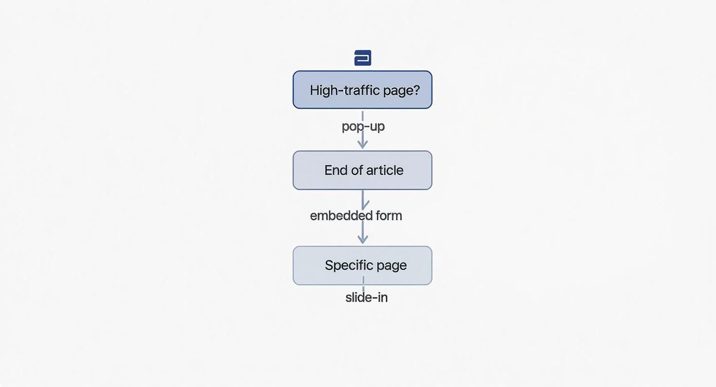
The key takeaway here is that your approach should adapt to the user's context. A pop-up might be perfect for general high-traffic areas, while more subtle embedded forms work better for capturing readers who are already deep into your content.
Practical Incentives That UK Consumers Value
It's crucial to offer things people actually want. For instance, the 2025 UK SMS & Email Marketing Report found that a massive 43% of UK consumers will share their details for free shipping, and 42% will do so for free gifts. This proves that practical, money-saving offers are incredibly effective in the UK market.
Interestingly, the report also notes that 44% of UK shoppers don't mind answering a question during sign-up if it leads to more personalised content or discounts later. This shows that interactive offers can help you build a more engaged and better-understood list right from the very start.
Expert Tip: The best lead magnets solve a small, specific problem for your ideal customer. They provide an instant win and position your business as a helpful resource they'll want to hear from again.
To help you brainstorm, I've put together a quick comparison of popular incentives and how they might fit different kinds of UK businesses.
Popular Sign Up Incentives for UK Audiences
| Incentive Type | Best For (Business Type) | Pros | Cons |
|---|---|---|---|
| Percentage Discount | E-commerce, Retail, Restaurants | High conversion rate, easy to implement. | Can attract one-time bargain hunters. |
| Free Shipping | E-commerce (especially with higher-value items) | Very strong motivator (43% of UK consumers). | Can impact profit margins if not calculated. |
| Exclusive Content | B2B, Coaches, Consultants, Service Providers | Attracts highly qualified, engaged leads. | Requires more upfront effort to create. |
| Early Access/VIP List | Fashion, Art, Limited-Run Products | Builds a community of loyal brand fans. | Only effective if you have regular launches. |
| Free Gift with Purchase | Beauty, Food & Drink, Subscription Boxes | High perceived value, encourages first purchase. | Logistical complexity and cost of goods. |
| Contest Entry | Broad Appeal (Events, Retail, Travel) | Can generate a large number of sign-ups quickly. | Often attracts low-quality leads, GDPR compliance is key. |
Choosing the right option really depends on your business model and the kind of customer you want to attract. For more ideas that go beyond the usual, it's worth exploring some creative incentive marketing strategies.
Even the simplest incentives can be highly effective. A few popular ideas that work well include:
- Exclusive Guides or Checklists: Offer a simple PDF that solves a common problem your audience faces.
- Early Access: Let subscribers be the first to shop new products or get access to your best sales.
- Interactive Quizzes: Use a fun quiz to help customers find the right product, then offer the results via email.
By carefully selecting an incentive that reflects your brand’s true value, you ensure every new mail list sign up is the start of a valuable and, hopefully, long-lasting customer relationship.
Navigating GDPR for a Trustworthy Mailing List
For any small business in the UK, getting your head around the General Data Protection Regulation (GDPR) can feel a bit daunting. But here's the thing: it's not just a set of legal hoops to jump through. It's your blueprint for building real trust with your audience.
When you handle your mail list sign up process with care and transparency, you're sending a powerful message. You're telling potential customers that you respect their privacy, which is the best possible way to kick off a relationship.
The cornerstone of it all is explicit consent. Simply put, you need to be completely upfront about what someone is signing up for, and they have to actively agree to it. The old tricks of pre-ticked boxes or vague, fuzzy language just don't cut it anymore. Consent has to be a clear "yes".
What Does Explicit Consent Actually Look Like?
Making your sign-up form compliant is really just about being clear and honest. Before anyone hands over their email address, they need to know what to expect. A generic "Join our newsletter" button is no longer good enough.
Here’s a step-by-step guide to making your form compliant:
- Add an Unticked Checkbox: Below the email field, add a checkbox that is not pre-ticked.
- Write Clear Consent Text: Next to the checkbox, write what they are agreeing to in plain English. For example: "I’d love to receive weekly recipes and exclusive offers from [Your Brand Name] via email."
- Link to Your Privacy Policy: Include a link to your privacy policy within this text so users can easily see how you handle their data.
- Mention Unsubscribing: Add a short sentence like, "You can unsubscribe at any time." This empowers the user and builds trust.
Here’s a quick checklist to make sure you’re on the right track:
- No Pre-ticked Boxes: This one is non-negotiable. The consent checkbox must start empty. Your new subscriber has to be the one to physically tick it.
- Use Plain English: Ditch the corporate jargon. Instead of something stiff like, "I agree to receive marketing communications," try a friendlier approach. "Yes, I'd love to get weekly tips and special offers by email" works much better.
- Be Specific: If you're going to send different kinds of emails—say, blog updates and separate promotional offers—it's best to give people separate options to choose from.
- Make Leaving Easy: Let people know they can unsubscribe at any time, right from the start. And, of course, every single email you send must have a clear, easy-to-find unsubscribe link.
Think of it this way: a compliant email list is built on transparency. Tell people what you're going to send and how often. This simple act of setting expectations builds a foundation of trust and results in a much more engaged list of subscribers.
Why You Should Use a Double Opt-In
While it’s not a strict legal requirement under GDPR (as long as you have other solid proof of consent), using a double opt-in is one of the smartest things you can do for your email marketing.
Here’s a step-by-step guide on how it works in practice:
- User Signs Up: A visitor fills out your sign-up form and clicks the button.
- Confirmation Email is Sent: Your email service provider automatically sends a confirmation email to the address they provided. The subject line should be clear, like "Please confirm your subscription."
- User Confirms: The user opens the email and clicks a confirmation link or button (e.g., "Yes, subscribe me to the list").
- Subscription is Activated: Only after they click this link are they officially added to your active mailing list.
This two-step process is brilliant for a few reasons. First, it weeds out typos and fake email addresses, which keeps your bounce rate low and protects your sender reputation. More importantly, it creates a rock-solid digital paper trail proving that person gave you their explicit consent. That’s peace of mind right there.
For a deeper dive into how we handle data protection, you can always refer to the Astonish Email privacy policy. By adopting these straightforward, transparent practices, you’re not just staying on the right side of the law—you’re building a healthier, more valuable email list from day one.
Automating a Welcome Sequence That Builds Rapport
The moment someone fills out your mail list sign up form is a golden opportunity. Seriously, their interest in what you do will never be higher than it is at that exact second. This is your chance to make a fantastic first impression with a swift, automated welcome sequence that confirms their subscription and starts building a real connection. Think of it less as a single email and more as a short, automated journey that works for you 24/7.
Don't underestimate how powerful this initial interaction is. Recent UK email marketing data shows delivery rates are hitting a massive 98%, with open rates climbing to 35.9%. People are genuinely opening and reading their emails. A thoughtful welcome sequence taps into this high engagement to cement your new relationship right from the get-go. You can dig into more of the stats in the DMA's 2025 Email Benchmarking Report.
The Essential First Email
Your very first automated email needs to land in their inbox immediately after they sign up. No delays. Its job is simple but absolutely critical, and it must do three things without fail.
- Confirm the Subscription: First off, welcome them aboard and let them know the sign-up worked. It’s simple reassurance that puts them at ease.
- Deliver the Incentive: If you promised a discount code, a free guide, or access to an exclusive video, give it to them right here, right now. Delivering instantly builds trust.
- Set Clear Expectations: Briefly let them know what's coming next. Something like, "Look out for weekly tips and exclusive offers from us every Tuesday!" manages their expectations perfectly.
Think of this first email as your digital handshake. It’s friendly, functional, and most importantly, it delivers on the promise you made on your sign-up form.
Building a Simple Three-Part Welcome Series
After that first contact, a short series of two more automated emails can do wonders for introducing your brand's personality and nudging your new subscriber towards taking the next step with you.
Your welcome sequence is so much more than a delivery vehicle for a discount code. It's your first real chance to tell your story, show your value, and make your new subscriber feel like they've just joined an exclusive club.
Here’s a practical, three-email sequence that you can easily set up in a platform like Astonish Email, Mailchimp, or ConvertKit.
- Email 1 (Sent Immediately): Welcome & Incentive Delivery. As we just covered, this is the instant confirmation that gives them what they came for.
- Subject Line Example: "Welcome to [Your Brand]! Here’s your 15% off."
- Content Tip: Keep it short. Welcome them, provide the discount code or link, and tell them when to expect your next email.
- Email 2 (Sent 2 Days Later): Introduce Your Brand Story. Now's the time to connect on a more human level. Share a quick story about why you started your business. Put a face to the brand and maybe point them towards your most popular product, service, or even a killer blog post.
- Subject Line Example: "Our story (and why we think you'll love it)."
- Content Tip: Use a friendly photo of yourself or your team. Link to your 'About Us' page or a best-selling product.
- Email 3 (Sent 4-5 Days Later): Ask a Question & Guide Them. Wrap up the sequence with a simple, engagement-boosting question. "What are you struggling with most right now when it comes to [your area of expertise]?" is a great one. It encourages a reply and gives you incredibly valuable insight. You could also use this email to point them towards your social media channels or a specific corner of your website.
- Subject Line Example: "Just one quick question for you..."
- Content Tip: End with a clear call to action, like "Follow us on Instagram for daily inspiration!" or "Reply to this email and let me know."
This simple, automated flow turns a one-off sign-up into a proper, multi-touchpoint experience that starts building a relationship that lasts.
Testing and Optimising Your Sign-Up Form for Growth
Getting your sign-up form live is a great start, but it's not the end of the story. The real magic happens when you start tweaking and improving it based on how people actually interact with it. This is where testing comes in, and it's less complicated than you might think.
The most common approach is called A/B testing. You simply create two slightly different versions of your form and show them to different groups of website visitors. Version A goes to one half, Version B to the other. By comparing the results, you take the guesswork out of what works. It’s all about making small, data-backed changes that can lead to big improvements in your sign-up rate over time.
What Elements Should You Test?
Here’s the golden rule: only change one thing at a time. If you tweak the headline, the button colour, and the main image all at once, you’ll have no idea which change actually made the difference. Keep it simple and focused.
Here is a step-by-step guide to running your first A/B test:
- Choose One Element: Decide what you want to test first. Let's say it's the headline of your pop-up form.
- Create Two Versions: Your existing headline is Version A (the 'control'). Create a new, different headline for Version B (the 'variation'). For example, A: "Join Our Newsletter" vs. B: "Get 15% Off Your Next Order".
- Use Testing Software: Use the built-in A/B testing tools in your email marketing platform or a tool like Google Optimize to show each version to 50% of your website visitors.
- Run the Test: Let the test run for a set period (e.g., two weeks) or until you have enough data for a meaningful result (e.g., 1,000 views per version).
- Analyse the Results: Check which version had a higher sign-up rate. If Version B performed better, make it your new permanent headline.
- Repeat: Choose a new element to test (like the button text or form placement) and start the process again.
Remember, the goal isn't just to get more sign-ups. It’s about finding the best way to attract high-quality subscribers who will actually open your emails and buy from you down the line.
To get the most out of this, it helps to get familiar with the basics of Conversion Rate Optimization (CRO). It’s the whole discipline dedicated to getting more website visitors to take the actions you want them to.
A Real-World Testing Scenario
Let's look at a practical example. Imagine a small, UK-based online coffee retailer. They want to see which incentive works best for getting people onto their mailing list.
- Version A (The Control): The form offers "Free Shipping on Your First Order."
- Version B (The Test): This version offers a "Free Guide to Brewing the Perfect Filter Coffee."
After running the test for a month, they check the numbers. Version A, the free shipping offer, got a 15% higher sign-up rate. An obvious win, you might think.
But they didn't stop there. They looked deeper into how these new subscribers behaved over the next three months. What they found was fascinating. The group from Version B—the ones who downloaded the coffee guide—had a 40% higher open rate on their emails and were twice as likely to become repeat customers.
This insight was crucial. While the free shipping offer attracted more people upfront, the brewing guide attracted better subscribers: genuine coffee lovers who valued the brand’s expertise. They made the smart choice to stick with the guide, optimising for long-term customer value, not just a quick win on numbers.
Got Questions About Your Mailing List? We've Got Answers
Even the most seasoned business owner runs into questions when setting up their email sign-up process. Let's tackle some of the most common ones I hear from small businesses across the UK, so you can move forward with total confidence.
Where’s the Best Place to Put My Sign-Up Form?
The short answer? Everywhere that makes sense. You don't want to rely on just one spot. Think of it like fishing – you cast multiple lines in different places to get the best catch.
Here are the go-to spots that consistently deliver:
- Your Website Footer: This is a non-negotiable. It acts as a permanent, reliable sign-up point that’s visible on every single page of your site.
- At the End of Blog Posts: You've just wowed them with your expertise. This is the perfect moment to invite them to get more of it, capturing them while they're highly engaged.
- A Pop-up or Slide-in: Timed correctly, these are incredibly effective. You can set them to appear after someone has been on a page for a minute, or just as they're about to leave (this is called 'exit-intent').
- On Key Pages: Your 'About' and 'Contact' pages are prime real estate. People visiting these pages are already looking to connect with you on a deeper level.
Do I Really Need Double Opt-In Here in the UK?
This is a big one. While GDPR doesn't explicitly mandate double opt-in, I always, always recommend it. Think of it as best practice that protects you and builds a much stronger list.
A double opt-in confirms someone really wants to hear from you and ensures the email address they entered is actually theirs and is spelled correctly. The result is a list full of genuine, engaged subscribers, far fewer bounces, and almost zero spam complaints. It's your built-in proof of consent.
How Often Should I Email New Subscribers?
Once someone joins your list, they're at their most interested. You'll want an automated welcome sequence to kick things off – usually 2-3 emails over the first week to introduce yourself and deliver any promised goodies.
After that? Consistency is your friend. A weekly or fortnightly email is a solid rhythm for most businesses.
The golden rule is to deliver value without clogging up their inbox. It’s a great idea to mention your sending frequency right on the sign-up form itself. A little bit of transparency goes a long way in keeping people subscribed and happy. This approach also keeps you on the right side of email best practices, which is central to our anti-spam policy.
Ready to put all this into practice? With Astonish Email, building a beautiful sign-up form and a powerful welcome sequence is genuinely simple. Start your free plan today and see how easy it is to grow your business.